
Living Coral also know as Pantone 16-1546 is a warm orange peach with a hint of pink and rich gold undertones. The color evokes creativity, energy, and optimism. It is also linked to the earth and sea. Did you know the marine life invertebrate get their gorgeous tone from the tiny algae living on it. Coral reefs provide shelter to the kaleidoscope under the sea. In your wardrobe, art, botanicals, or as an accent, this color can make you and your space pop. We all seek the inspiration of color found in nature. It can enrich our lives and strengthen our own personal energy.
Welcome to our Living Coral edition of When Fashion and Nature Collide. On the third Wednesday of each month, we will post a new collaborative edition. You will see art, beautiful fashion and accessories styled by Dominique from 3C Style, botanicals, critters, and beautiful art by Darren from the Arty Plantsman, and botanicals, critters and art from me Lisa@Lismore Paper. Be sure to check out each blog for the full edition. Check out our shop for the original fashion and accessories from all of our editions.
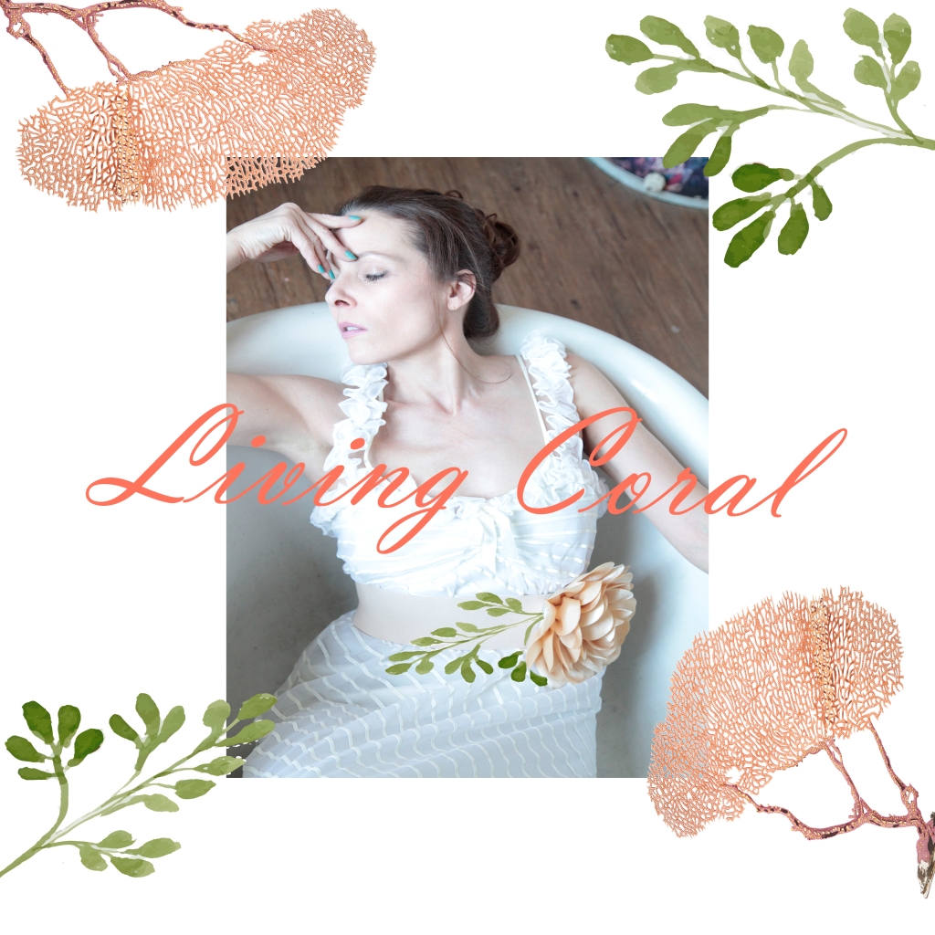
A Pop of Coral – Coral, Zucchini Flower, and Protea Cynaroides, oh my!

What better way to celebrate Living Coral than with a Pop of Coral! Inspired by ocean coral, zucchini flower, and Protea (honeypot or King Sugarbush) now how can you not love those common names? Dominique is putting her artistic touch on the flowers in the botanical garden. Her coral dress is the perfect pop of color in that space. The sea colored pillows compliments the coral color beautifully.
Land Sea Earth – To Love Nurture Protect
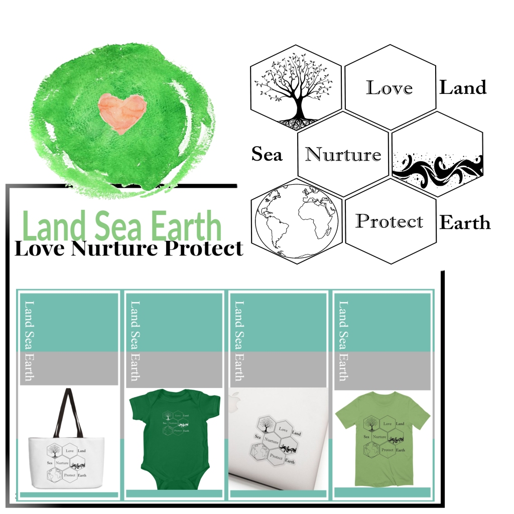
This original design was a poster I created for another local project, more lake oriented than sea. When looking at it and considering what I do for a living, it made sense to make the design more global. Bees are such an important part of life, I wanted the honeycomb pattern to be represented. Trees are truly the lungs of the earth, we need to love our land. It’s like clean air gardening. The Sea, where do we begin. 70% of the Earth’s surface is ocean, and without it the other 30% would barely be habitable. We need to nurture our sea, coral reefs, and we need to protect our beautiful Earth. Conserving what we have is important. I am so excited to share this clean and earth friendly design. This is one I am proud to wear. Dominique is wearing this at the botanical garden.
Ant Barcode – A Fashion Statement
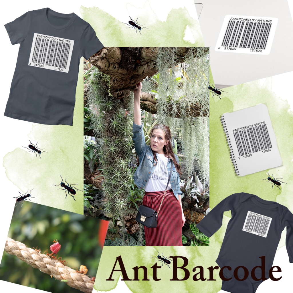
Ants have a big impact on our environment. They are like our own secret gardeners. Did you know they turn up more soil than earthworms, aerate the soil, and recycle nutrients. They make healthy soil for our plants and even aid in pollination. They also make a great fashion statement and can be worn with the living coral accessories!

Join us for Earth Day! A special collaborative post. We will be showing new work. Darren has a sneak peak!
Thank you for visiting and reading the Living Coral edition. Look for our next edition of When Fashion and Nature Collide on May 15th. We will be adding new items to our store! Perfect for the nature lover in all of us.
Much love & hugs,
Lisa

Coral is such a pretty color.
LikeLiked by 2 people
It truly is like a jewel and so complimentary. 💗
LikeLiked by 1 person
Wonderful post Lisa. You put such thought into your writing and the information is so interesting.
I also love reading about the designs that I was not directly involved in, and how you create your designs.
The bug barcode is so cool! And the Land Sea Earth design is just incredibly professional as well as beautiful and appropriate.
This is a really special edition!
Love and a big hug! Xx
LikeLiked by 3 people
Thank you, Darren! You and Do have inspired me beyond possibilities. It was a challenging and rewarding month. I love our team so much. It was a very special issue indeed. You are brilliant my friend. Love and big hugs! 💗
LikeLiked by 2 people
What a beautiful shade of color. I have a shirt close to that shade. Snorkeling, they are remarkable as the sunlight wades through the water landing nicely on the coral. There’s nothing like it. The flowers Darren took are outstanding! What a mix! I particularly liked the butterfly with the touch of blue. Such a joy to read and see what you guys bring to the table. Hugs from me. – Alan
LikeLiked by 3 people
I agree that shade of coral is gorgeous and how complimentary it is to wear. It is a sight to see, snorkeling near a coral reef on a sunny day. I think everyone should experience that at least once in their lifetime. Darren has this unbelievable catalog of flowers, it truly amazes me. We appreciate your love and support Alan. Thank you so much! Big hugs from Michigan!!
LikeLike
Such an amazing post, Lisa. Lots of meaningful information. So nice to discover what you and Darren will come up with each month. Although we talked and exchanged a lot about our monthly theme I am always super excited to read you both. Great job sis. I enjoyed this one tremendously. Agree with you both. It is a very special edition. xoxo
LikeLiked by 2 people
Thank you, Sis!! This one was a special post. I am always excited to see your posts, too! Sometimes it amazes me how our words align and we dont tell each other what we are going to write. It is so exciting for me, it truly makes me grateful. Love you and Darren so much.
LikeLiked by 1 person
What a beautiful post, Lisa. Every month you guys come up with so much of fresh ideas – wish you the best
LikeLiked by 3 people
Thank you 💗 so happy you can visit each month. We really appreciate it! All the best and hugs to you!
LikeLiked by 1 person
My absolute pleasure 😊🌸
LikeLiked by 1 person
All so lovely, as always!
LikeLiked by 2 people
Thank you, Becky!! 💗
LikeLiked by 1 person
Brilliant creations once again .You managed to make me like coral😀
My mom is mad about it , I never share her taste but as I said to Do unique now………I have to convert.
Those draws are amazing and I loved to read the explanations behind😍
LikeLiked by 2 people
Thank you!! Coral is a feel good color. I am so happy you like the drawings. Sometimes the path getting there is fun and meaningful. Hugs!! 💗
LikeLiked by 1 person
Your drawings are always amazing.I can’t hold a pencil and I so admire your talent.😀
LikeLiked by 1 person
A beautiful collaboration of minds & hearts.
LikeLiked by 2 people
Thank you so much! That is beautiful 💗
LikeLiked by 1 person
Coral is one of my favourite colours Lisa and I love this months collaboration. You guys are amazing. I am also looking forward to your Earth Day posts.
LikeLiked by 2 people
Thank you, Brigid! That means the world to me! I love the coral tones, too.
LikeLiked by 1 person
I love coral, back in the 90’s l was a manager for River Island, and we had a stock range of what were known as Mouflon Jackets, they had a colour selection unlike any other jacket on the market with a colour range of something like 35 colours, and one of the colours was this beautifully rich dark coral. The beauty of that particular range of jacket was that with some vibrant colours combined with the fact that they were single breasted jackets meant that you could colour coordinate with many other colours and for men, in the early 90’s unlike today, there was such a much fuller vibrancy and flexibility available that there simply isn’t today.
Ps: Lisa, did you get my email l sent through your contact form?
LikeLiked by 2 people
Those jackets sound like they were really neat. That sounds like a fun job, too! Let me check for that email. 🐝🌿
LikeLiked by 1 person
They were great jackets and affordable too – l must have had 15 of them myself 🙂
LikeLiked by 1 person
That is fantastic! You never can have too many 😊
LikeLike
Love the pale coral and green with the white dress in the first photo, it’s so soft looking!! That color does not flatter me, but I keep trying, because I love it!! Also love the green earth with coral heart…fresh and lovely ideas🍑 I’m excited to see what you all create for Earth Day💚
LikeLiked by 2 people
Thank you! I was so struck by Dominiques picture, I just had to add my own touch to it. Coral is a beautiful color. So pleased you like the designs! Im excited to share the Earth Day post 🌿💗
LikeLiked by 1 person
So lovely! I have nominated you for the Sunshine Blogger Award! Enjoy it! https://popsiclesociety.com/2019/04/19/sunshine-blogger-award-5/
LikeLiked by 2 people
Thank you so much!! 💖 So very kind of you!
LikeLiked by 1 person
My pleasure 😊
LikeLiked by 1 person
Yet another wonderful post. I do love your collaborations and your art work. Have a great weekend xx
LikeLiked by 2 people
Thank you, Gill! I hope you have a wonderful weekend 💗🌿🌻
LikeLiked by 1 person
I love the detailed description you gave about coral. The art is wonderful and the ant barcode gave me chuckle! ❤️
LikeLiked by 2 people
Thank you, Linda! I had a good time putting together those ants 😂💗 So happy it made you smile 😊
LikeLiked by 1 person
I love the color of the coral. It is a color most anyone looks good in.
LikeLiked by 2 people
Me, too! I find it compliments all complexions beautifully.
LikeLiked by 1 person
I just love coral! It’s such a calm yet enegizing colour as well. 😊
And your ant barcode is just brilliant!! As is the interconnecting honeycomb design which illustrates perfectly that it’s all one unity. 💕
LikeLiked by 2 people
Me, too! Such a brilliant color. Thank you! Those little ants work well together 😊 Im so happy you like the honeycomb pattern, they make the perfect framework. 💗
LikeLiked by 1 person
I love that color! For some reason my husband always thinks coral is pink….I try tell him it is not but he is not convinced.
LikeLiked by 2 people
That makes me laugh because my husband says that, too!! 💗
LikeLiked by 1 person
Wonderful 🙂
LikeLiked by 2 people
Thank you 💗
LikeLike
Happy Easter to you and your family!
LikeLiked by 2 people
I hope you and your family had a lovely Easter 🌺🌿💗
LikeLike
The ideas that you all come up with for the project are always so interesting. Living in Florida, coral is a very popular color…you see it in our homes and our clothes as well.
LikeLiked by 2 people
Thank you, Karen! Your state inspires so many beautiful colors and sea critters. 🌟🌿🌺
LikeLiked by 1 person
Such beautiful creations! What a pretty color coral is😍 and I love the land, sea, earth design!
LikeLiked by 2 people
Thank you!! Makes me so happy you like that design 😊 Love the coral color, feels like vacation.
LikeLiked by 1 person
I love the color of coral, especially on Dom! Not sure that would work on me😂
Such a beautiful post Lisa!🌟
LikeLiked by 1 person
Doesn’t that color look amazing on her! Thank you! I think you would look gorgeous in it 💗🌼🌟
LikeLike